A thirty-day app retention rate is 6.48% only. It shows that most people delete or stop using mobile applications soon after installing them. What makes them toss apps away?
Even though the lack of storage is the first reason to remove an app, the design also matters. Poor UI makes an application inconvenient to navigate and confusing. Hence, you must ensure your mobile app has a custom UI design tailored to its users’ behavioral patterns and needs. Only then will users be truly satisfied with their experience.
Not sure what a quality UI design means? Keep reading to learn everything you should know.
Why Do You Need a Custom UI App Design?
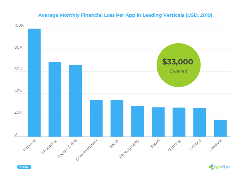
Based on recent research, the average app loses around $33,000 per month because of uninstalls. Consumers have too many options to choose from and don’t waste time using apps they don’t like.
A custom mobile app design can help reduce financial losses. By meeting the needs of its target audience, the app is more likely to make customers stay and bring some other benefits, including:
- Higher return on investment
- Increased customer loyalty
- Stronger brand image through positive reviews and feedback
- Competitive advantage over similar apps
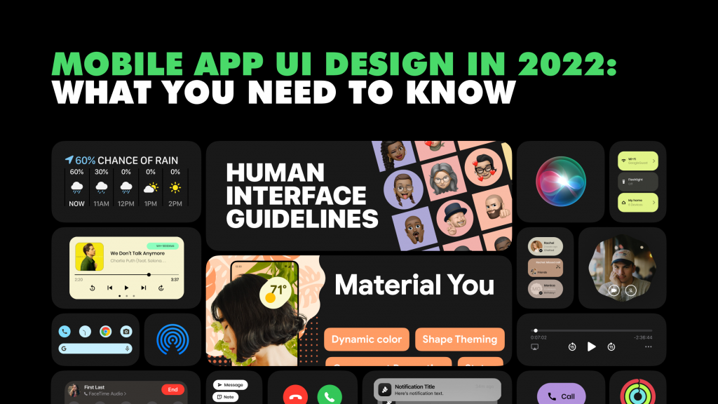
Top UI Mobile App Designs to Draw Inspiration
If you cannot tell the difference between good and bad design, try using the app, and you will feel it. You can also check the software designed by market leaders since they usually invest a lot in UX/UI. These apps show what quality UX/UI is and have millions of users.
Here are some options to test and learn from:
- Uber. This app serves as a prototype for most taxi apps developed worldwide. It has balanced features, excellent visualizations, and good logic.
- Pinterest. The app perfectly handles the task of being a board for billions of uploaded images. Advanced filtering and tags considerably simplify search, which is particularly crucial in this mobile application.
- Calm. This meditation app has an extensive menu, enabling users to find tracks that best match their needs and mood. The buttons are also very illustrative, which additionally facilitates in-app navigation.
How to Create a Proper UI App Design
Why are professional designers so critical for custom mobile app creation? They know the basic design rules and have years of experience. This experience helps them tell what works and what doesn’t from the start to avoid never-ending changes.
Below are some tips shared by Leobit Design Studio‘s team. Use them while working on your app.
Always put users first
When you build an app, you do it for end-users. Hence, you must research your target audience and their current needs before working on the design. Once you collect information about them, you need to create:
- User persona. Develop a fictional character with the traits of your potential audience to better understand whom you target.
- User scenarios. Think about how users behave in the future app and what actions they complete to achieve the goal.
- Experience maps. Visualize the end-to-end experience of someone downloading your app and using its core functionality.
Stick to standards
Mobile apps are not the type of software to experiment with much. People download mobile applications to solve practical tasks, not to look at design hacks. Therefore, you need to make the navigation predictable and use standard screens, like Get Started, Personal Info, Settings, Home, etc.
Avoid clutter
Too many details distract attention and may even make users bounce. That’s why you must remove all unnecessary elements from the screen. Leave only several buttons required to navigate the app and use its features. Be careful with text or pop-ups since mobile users are unlikely to read long explanations.
Ask users for as few actions as possible
Design an interface that minimizes the number of steps necessary to achieve the final goal. For example, if a person needs to order a taxi, they must be able to enter an address and check the price right on the main page. You also shouldn’t add too long forms to collect personal and payment details. A sign-in through Gmail and social media is a perfect way to reduce the number of actions on the user’s side.
Make interactive elements predictable
When a user sees a button or another interactive element, they must know how it responds to interactions. Hence, you must use a standard approach for menus, social media sharing, taking a photo, etc. Besides, avoid adding visual elements that look similar to buttons but are unclickable. It confuses users and results in a poor UI design.
Minimize push-notifications
In 28% of cases, people uninstall apps because of excessive ads and push notifications. So you must balance the frequency and number of push alerts you deliver. Send them only when something critical happens or you need an immediate response.
Additionally, a GoodFirms study reveals that 73% of users distrust apps that request too many permissions, and 46% believe apps often ask for unnecessary access, leading to further uninstall risks and lower user retention. Designing with transparency and minimal interruptions is essential to building trust and engagement.
Avoid split screen
Although some modern smartphones support split-screen apps, most users still don’t have them. Therefore, your UX/UI design shouldn’t have split design features. Instead, try to include all the functionality critical to complete a particular action on a single screen.
Stay consistent
This tip is an obvious one, but it’s still worth mentioning. The UI elements that perform the same function should have the same color, form, and style within your app. You should also stick to one color palette for background, branding, and other mobile app design elements.
Make the Back button convenient
The Back button must be hard to click by mistake. It prevents users from messing up the multi-step process. At the same time, users must be able to return to previous steps to edit or double-check the information.
The best way to find a balance is using the Back button of smartphones or putting it on the top left of the mobile app.
Mind screen orientation
Create a responsive design that looks appealing both vertically and horizontally. The most popular elements must be at the bottom of the screen since that’s where users place their thumbs.
Follow platform guidelines
Each platform has its strengths and limitations. Hence, you should tailor UI to specific platform guidelines and follow the generally accepted best practices. Thanks to this, the mobile app look will be more familiar to users, and its design quality will improve.
Ensure accessibility
Remember about people with movement disabilities, hearing impairments, and low vision, especially if you create an app for a broad target audience. You need to:
- Make the touch target big enough (at least 9X9 mm)
- Place buttons in easily accessible spots
- Keep device gestures simple
- Add easy data entry methods
- Use color contrast ratios that are acceptable to most people
Leobit for Custom App Design Services
Leobit is a software development company that has launched a separate Leobit Design Studio to provide UX/UI design services. We can consult your company and assess an existing app or complete the practical tasks, be it prototyping or delivery.
Here are only several examples of our designs:
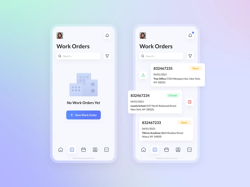
- Information architecture and app layout for a US fire inspection platform
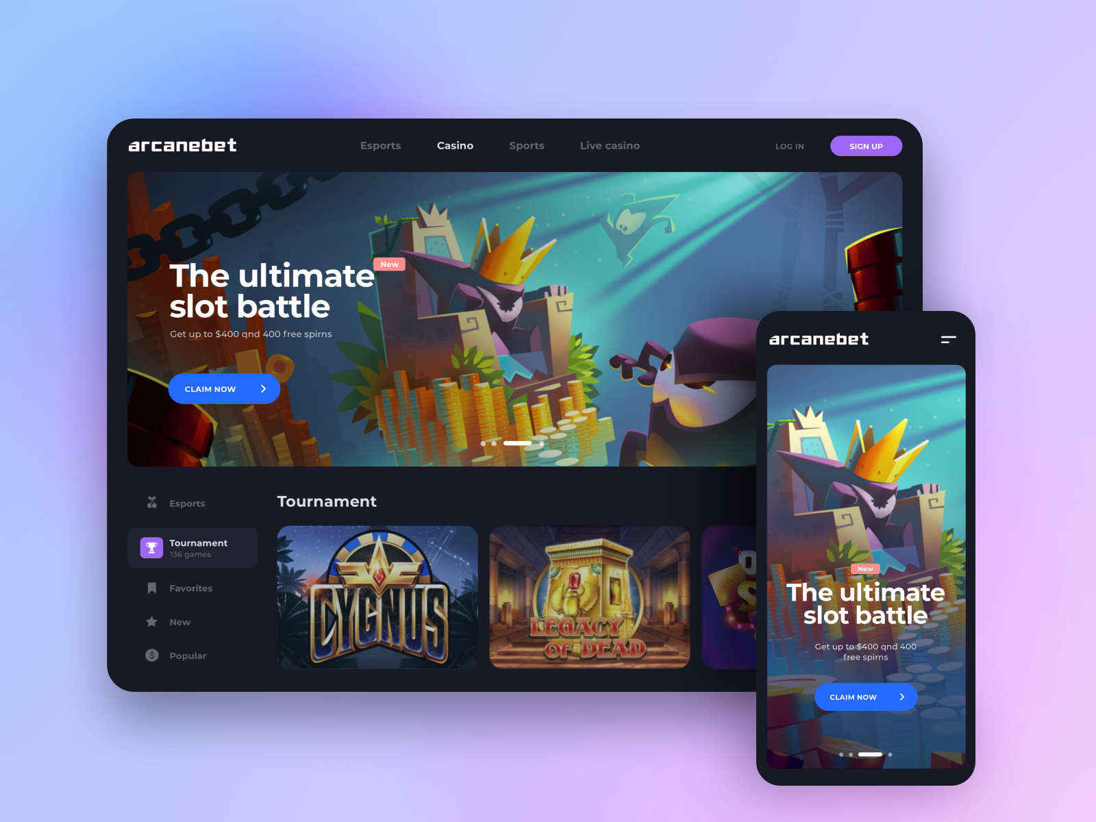
- End-to-end UX/UI development for a betting & gaming solution
Visit this page for more examples of our UX/UI design projects.
Final Thoughts
Even though the tips we’ve shared might seem easy to follow, the implementation is challenging. Hence, hiring a professional UX/UI designer to power your tech team is essential. An experienced designer will research your target audience, develop the most appropriate UX/UI, and closely cooperate with engineers to implement everything.
Looking for professional design help? Contact us to discuss your project and get a quote.