Yurii Shunkin
Yurii Shunkin
On-Demand Webinar "From Traditional Automation to AI Agents: What fits your project best"
Contact us

Designing Software Without Barriers: How to Build Accessible and Inclusive Applications

Oct 28, 2025

17 mins read

Designing Software Without Barriers Designing Software Without Barriers: How to Build Accessible and Inclusive Applications
Want a quick tech consultation?
Yurii Shunkin | R&D Director

Yurii Shunkin

R&D Director

Contact us

Around 1.3 billion people worldwide live with a disability, which corresponds to 16% of the world’s population. In the U.S. alone, that’s 61 million adults, according to the CDC. Despite this growing market share, the digital world hasn’t kept up.

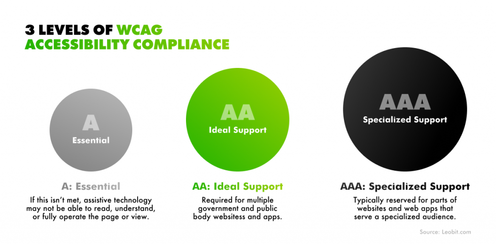
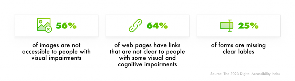
The 2023 Digital Accessibility Index report states that only 3% of the web meets accessibility standards. This means that millions of people find most websites and software difficult or even impossible to use.

Statistics from the 2023 Digital Accessibility Index report

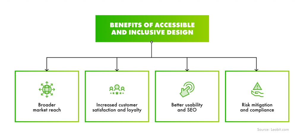
However, inaccessible software doesn’t just create usability challenges. It locks out potential users from the start, thereby limiting your market reach.

In this guide, we’ll share insights on how to design accessible websites and applications, as well as the benefits they bring to your business.

But let’s start from the basics.

What is Accessible Design?

Accessible UI/UX design is the practice of creating digital products that everyone can use, regardless of their physical, sensory, or cognitive abilities. Accessibility in design focuses on removing barriers that prevent people with disabilities from using a software product, be it a website or a mobile application.

Unlike universal design, which aims to create a single experience that works for everyone, accessible UX design recognizes that there is no such person as a “typical” user. People can use apps or visit websites under different circumstances. Accessibility embraces that diversity.

Accessibility vs. Inclusion in UI/UX Design

In software development, inclusive design and accessible design are often used interchangeably. Both aim to create better digital experiences, yet they approach the goal from different angles and at different depths.

Accessible design is focused on ensuring that every interaction, visual element, and piece of content can be perceived, understood, and operated by all users, regardless of their abilities or tools.

Inclusive design embraces accessible design by building upon it

Inclusive design, in its turn, pushes designers to think beyond compliance. It’s a proactive approach to designing for the full spectrum of human diversity. Inclusive design considers not just disabilities, but also different contexts, environments, and situations. For example, designing for users with low vision also helps those using a phone in bright sunlight. Or using captions assists users who are deaf, and people watching videos in a noisy café.

Common examples of user limitations

In a nutshell, inclusive design is a broader term that covers digital accessibility and goes beyond it by ensuring your product works well for everyone and naturally adapts to different users, environments, and contexts.

But why does inclusive and accessible UI/UX design matter for your business? Let’s figure it out.

Benefits of Accessible and Inclusive Design for Software Products

As more companies recognize the value of user-centric design, accessibility is moving from a “nice-to-have” to a core part of digital strategy. Industry leaders like Microsoft, Apple, and Google have already made inclusive design a foundation of their product development.

The shift is catching on across the tech landscape. According to the 2024 Accessibility and Inclusive Design Survey, 44% of tech and legal professionals worldwide say digital accessibility has become a higher priority at their companies. The survey also revealed that 77% of organizations now have a dedicated person or team responsible for accessibility, and 87% said their accessibility expert or team employs inclusive design principles.

So, why is accessibility important? And what makes companies invest in accessibility in software development?

The answer to these questions lies in the benefits that both accessible and inclusive design can bring to your business. Here are some of them.

Benefits of accessible and inclusive design
Benefits accessible and inclusive UI/UX design can bring to business

Broader market reach

People with disabilities represent an emerging market of 1,6 billion potential users representing over $2,6 trillion of disposable income in the United States, United Kingdom, European Union, and Canada alone. Investing in inclusive and accessible UI/UX design expands your audience to include not only people with disabilities, but also older adults, non-native speakers, and users with temporary or situational limitations.

Increased customer satisfaction and loyalty

Forbes reports that inclusive design strategies lead to measurable increases in customer satisfaction, retention, and business growth. Research from EY supports this connection, showing that inclusive UX practices reduce rework, improve overall usability, and strengthen brand equity. When teams design for all kinds of users, everyone benefits. Inclusive products feel better to use and leave a positive, lasting impression.

Better usability and SEO

Products built with inclusive design principles can reach up to four times the size of their intended audience and let your company expand market reach and drive new revenue opportunities. Accessibility also strengthens usability and search performance. Clear navigation, descriptive content, and logical structure improve both user satisfaction and SEO, so more people can find and use what you’ve built.

Risk mitigation and compliance

Laws such as the Americans with Disabilities Act (ADA), Section 508 in the U.S., and the European Accessibility Act mandate that digital products and services be accessible to all users, including those with disabilities. These regulations apply broadly to websites, mobile apps, and software platforms across both public and private sectors.

Companies that fail to meet these standards can face growing legal and financial risks. For instance, in 2024 alone, more than 4,000 lawsuits were filed in U.S. state and federal courts over inaccessible websites and mobile apps. The cost of settlements, retrofits, and reputational damage far exceeds the effort required to build accessibility from the start.


Creating truly accessible software requires a structured way to evaluate and measure how well a product meets real user needs. That’s where established accessibility frameworks and standards come in.

Accessibility Considerations in UX Design: How To Measure It Right

To know whether a product is truly accessible, it must be measured against recognized standards. Since 1997, the World Wide Web Consortium (W3C) has led global efforts to define what accessibility means in practice and how it can be implemented consistently across the web.

Two key outcomes of this work are:

  • Web Content Accessibility Guidelines (WCAG). It’s a global standard that defines how to make web content more accessible to people with disabilities.
  • Web Accessibility Initiative – Accessible Rich Internet Applications (WAI-ARIA) specifications. It’s a set of technical specifications that make it easier to implement WCAG requirements, especially for dynamic or interactive web content such as menus, modals, and web applications.

To help companies measure their level of accessibility, WCAG defines three levels of compliance:

  • A (Basic). This level addresses the most essential accessibility issues, ensuring that users can access and interact with basic website or app content. However, it does not eliminate all barriers and should be considered a minimum baseline rather than a complete solution.
  • AA (Strong). It builds on A-level compliance and is the recommended standard for most organizations. It ensures usability across a broader range of devices, contexts, and user needs by adding around 20 additional requirements, including color contrast of at least 4.5:1 for normal text.
  • AAA (Excellent). It incorporates all A and AA requirements plus 28 additional enhancements. While this level is ideal, it can be difficult or impractical to achieve across all content types. Key AAA requirements include color contrast of at least 7:1 for text and background, sign language interpretation for all video content, and audio descriptions for all visual content, among others.
WCAG defines three levels of compliance: A, AA, and AAA

Understanding WCAG compliance levels is the foundation of accessible design, but building it into real products isn’t always a piece of cake. According to the 2024 Accessibility Survey, 38.5% of websites have unclear page structures, and 45.1% of error alerts fail to provide meaningful descriptions.

Top 5 accessibility problems stated in 2024 Accessibility Survey
Top 5 accessibility problems reported in 2024 Accessibility Survey

To ensure a product truly aligns with A, AA, or AAA requirements, you need to test, measure, and validate accessibility throughout the development process.

Accessibility testing tools and methods

Effective accessibility testing combines automated tools, manual reviews, and user testing with assistive technologies to get a complete picture of usability.

  • Automated testing tools. Automated tools quickly identify common issues like missing alt text, low color contrast, or incorrect heading structures. Popular options include WAVE, axe DevTools, Lighthouse, and Accessibility Insights. These tools are a great first step, but they only catch around 30–40% of accessibility barriers.
  • Manual audits. Manual testing fills in the gaps that automation misses. Designers and developers should review layouts, keyboard navigation, focus order, and interaction states to ensure a smooth experience for all users. This process helps verify that content is logically structured and visually clear.
  • User testing with assistive technologies. Ensuring accessibility goes beyond just checking off compliance boxes. The most valuable insights come from real users, especially those who rely on tools like screen readers (NVDA, JAWS, VoiceOver), keyboard-only navigation, or speech recognition software. Observing how these users navigate a product reveals barriers that might otherwise go unnoticed.

Combining automated checks with human evaluation ensures a more complete and accurate accessibility assessment. Regular testing, not just at launch, helps you maintain compliance and improve usability of your software.

How Accessibility Works in Practice

Here, we’ve gathered the key accessibility considerations to help you make your UI/UX accessible to everyone. These principles cover the most common areas where accessibility often breaks down.

Color contrast & color blindness considerations

Proper color contrast ensures that users can clearly distinguish between elements, especially those with similar visual characteristics, such as buttons, icons, or text and background colors.

However, contrast isn’t just about color. It also involves size, shape, visual weight, and texture. All of these elements contribute to how easily a user can perceive and interact with interface elements.

Leobit regularly tests website contrast with the Stark plugin to ensure accessibility complience

Yet, relying on color alone can create barriers for people with color vision deficiencies, so designers should use multiple visual cues to communicate meaning (for example, pairing color with icons, text labels, or patterns).

Leobit tests its website to ensure it performs well for users with color blindness

To pass WCAG AA compliance, you should ensure that all text and essential visual elements meet minimum contrast thresholds, which is at least a 4.5:1 ratio for standard text and 3:1 for large text or bold headings. Here’s a good example that illustrates how contrast affects readability.

Examples of how color contrast affects readability

Screenreader compatibility

Screen readers make digital content accessible to users who are blind or have low vision by converting on-screen information into speech or braille. To be compatible, your software should be structured, semantic, and have navigable interfaces that these assistive technologies can correctly interpret. To ensure this, pay attention to the following aspects:

  • Alt text that adds meaning. Alternative text should convey the image’s purpose and its relationship to the surrounding content. For example, instead of “photo of a shopping cart,” use “add item to shopping cart” if the image is a functional button.
  • Proper use of headings and semantic structure. Headings (H1, H2, H3) provide visual styling and define the content hierarchy for screen readers. Each page should have only one H1, which clearly describes the main topic. The rest of the text should be divided and organized under well-structured subheadings (H2, H3, etc.). We also suggest using semantic HTML tags for all elements (not just for headings) so that assistive technologies can accurately read the page.
Proper use of headings and semantic structure
  • Keyboard navigation (tab usage). For users experiencing motor difficulties, it’s important to be able to use only the keyboard. That’s why it is essential for all interactive elements (buttons, links, forms) to be reachable via the Tab key. The focus state (i.e., the element currently selected) should always be clearly highlighted visually. That said, navigation order should follow a logical sequence, starting with primary actions and ending with secondary ones.

By designing with screen reader compatibility and keyboard accessibility in mind, you create an interface that complies with accessibility standards and is also more structured, consistent, and usable for everyone.

Subtitles and audio descriptions

Subtitles make spoken content accessible to users who have permanent or temporary hearing problems. It should be easy to read, synchronized with the dialogue, and accurately convey both speech and relevant sound cues.

Audio descriptions serve the opposite need: they make visual content accessible to users who are blind or have low vision. These narrations describe key visual details, such as actions, objects, settings, facial expressions, and scene changes, as well as identify speakers and nonverbal sounds like music or background noise.

Hidden Aspects of UX/UI Accessibility

Accessibility goes far deeper than what’s on the screen. Many barriers that affect digital experiences often go beyond the obvious and are rooted in cognition, attention, memory, and context. These factors may not always be visible, but they profoundly shape how people perceive, process, and interact with information.

Here we’ve gathered some of them.

Dyslexia, ADHD, and cognitive overload

​​Dyslexia is the most common learning disability, accounting for about 80% of all learning disorders. It impairs a person’s ability to read, write, and process language, thereby affecting how individuals perceive texts. An estimated 5–10% of the global population live with some degree of dyslexia, which is up to 700 million people globally.

To serve people with dyslexia, you should pay attention to typography choices. Use clean sans-serif fonts such as Open Sans, Roboto, Lato, or Inter, and keep the font size at least 12pt for readability. Avoid italics and underlining, as they reduce legibility, and use line spacing of about 150% (1.5× font size) to create breathing room between lines. To make scanning easier and reduce visual fatigue, text lines should also remain short (e.g., ideally 60–80 characters per line).

You should also pay attention to managing cognitive load (i.e., the total amount of information a user must process at one time). Breaking content into digestible chunks, using clear headings, and supporting text with visuals all help users stay oriented and engaged. Minimize distractions like autoplaying media or pop-ups, and visually organize information through hierarchy and grouping.

Proper fonts for users with dyslexia

Neurological disorders

To properly serve users with epilepsy, migraines, sensory processing disorders, or other neurological conditions, follow the WCAG recommendations, which state that no element should flash more than three times per second. This simple rule helps prevent photosensitive seizures and reduces sensory strain for all users. However, if you have to use flashing, intense motion, or content with loud sounds, always include clear warnings.

Another key accessibility step is to allow users to adjust or disable animations, vibrations, and audio or video playback. This will give them control over sensory input and help tailor the experience to their comfort level.

Cultural differences

Inclusive software product design patterns also extend to cultural and linguistic diversity. Symbols, gestures, colors, and even text direction can carry different meanings across regions. For example, icons or idioms familiar in one culture may confuse users in another. Designing for inclusion means acknowledging these nuances by using clear language, culturally neutral visuals, and adaptable localization strategies.

Examples of neutral icons for web and mobile applications

While awareness of accessibility has grown, implementation still lags behind. According to Applause’s 2024 Digital Accessibility Survey, more organizations than ever are prioritizing accessibility, yet many teams struggle to deliver fully inclusive products. In fact, 73% of respondents said their organizations aren’t adequately equipped to test for accessibility on an ongoing basis without external help.

This gap highlights a critical challenge: accessibility requires expertise, time, and dedicated resources, all of which companies may lack internally. That’s where experienced technology partners can make a difference.

How Can Leobit Help Ensure Accessibility in Software Development?

At Leobit, accessibility isn’t treated as an afterthought but as an integral part of every stage of custom software development. To ensure that every software solution we build works for everyone, regardless of ability, our teams combine UX research, inclusive design practices, and thorough testing.

Our UI/UX design services are based on globally recognized accessibility standards such as the WCAG and the WAI-ARIA specifications. We embed them directly into our development and QA workflows. This approach helps us detect and address potential accessibility issues early in the UI/UX design process.

Beyond compliance, Leobit helps clients build human-centered, inclusive experiences that improve usability, engagement, and market reach. Our developers and designers work collaboratively to translate accessibility requirements into scalable, elegant solutions that strengthen both product performance and brand reputation.

Accessible web design examples

In one of our recent projects, we performed a comprehensive modernization and reengineering for a UK-based SaaS stakeholder management software provider, with accessibility being a top priority.

Our team redesigned legacy pages, implemented accessibility-focused improvements across the UI, and conducted a full Lighthouse accessibility audit. The results showed 100 Lighthouse scores for new pages, compared with 68–93 for legacy pages. This improvement enhanced the product’s compliance with WCAG standards and significantly improved usability and user satisfaction across all user segments.

Conclusion

Accessibility and inclusivity in UX/UI design go far beyond mere compliance standards. It’s about recognizing that every user interacts with technology differently and ensuring that digital products work for all of them, not just for the majority. When accessibility is built into software from the very beginning, it leads to clearer interfaces, smoother user experiences, and stronger customer trust.

The global shift toward inclusive technology is well underway. Yet, as research shows, many organizations still struggle to turn awareness into action. True accessibility requires expertise, process, and commitment. That’s where experienced partners like Leobit make a difference.

At Leobit, accessibility isn’t just about meeting standards — it’s about building digital products that empower every user to participate fully. By integrating accessibility from day one, we help our customers reduce risk, expand their audience, and create more inclusive, future-ready software.

FAQ

Accessible design focuses on removing barriers that prevent people with disabilities from using digital products. Inclusive design goes a step further and anticipates needs of users from different cultures, backgrounds, languages and environments.

Accessible products reach wider audiences, reduce legal risks, and improve overall user satisfaction. They also strengthen brand reputation, enhance SEO, and increase revenue potential by including users who are often excluded from traditional design approaches.

Testing should combine automated tools (like Lighthouse, axe DevTools, or WAVE), manual audits, and user testing with assistive technologies such as screen readers. Automated scans catch technical issues, while real-user testing ensures that accessibility works in practice.

Leobit integrates accessibility best practices into every stage of software development, from UX design to testing. By following WCAG and WAI-ARIA standards, conducting audits, and optimizing code for assistive technologies, Leobit ensures that products are inclusive, compliant, and high-performing.